North Carolina
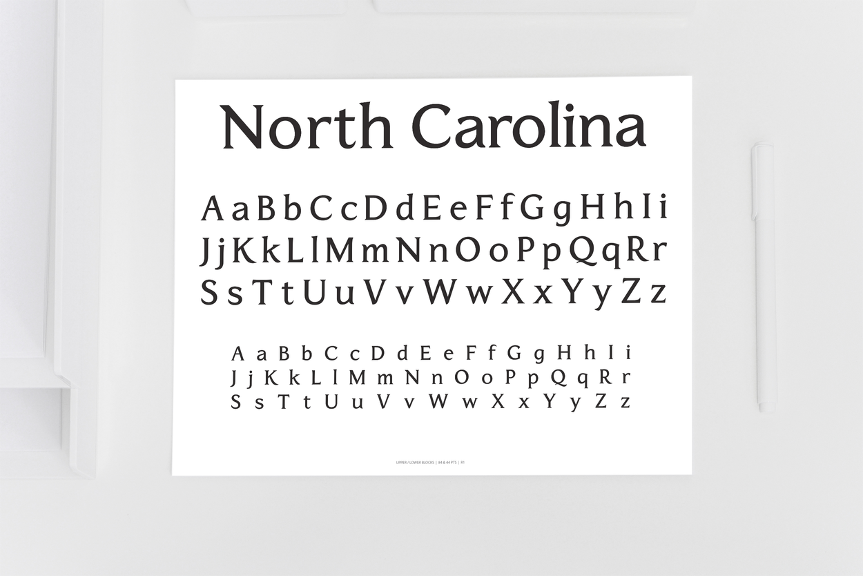
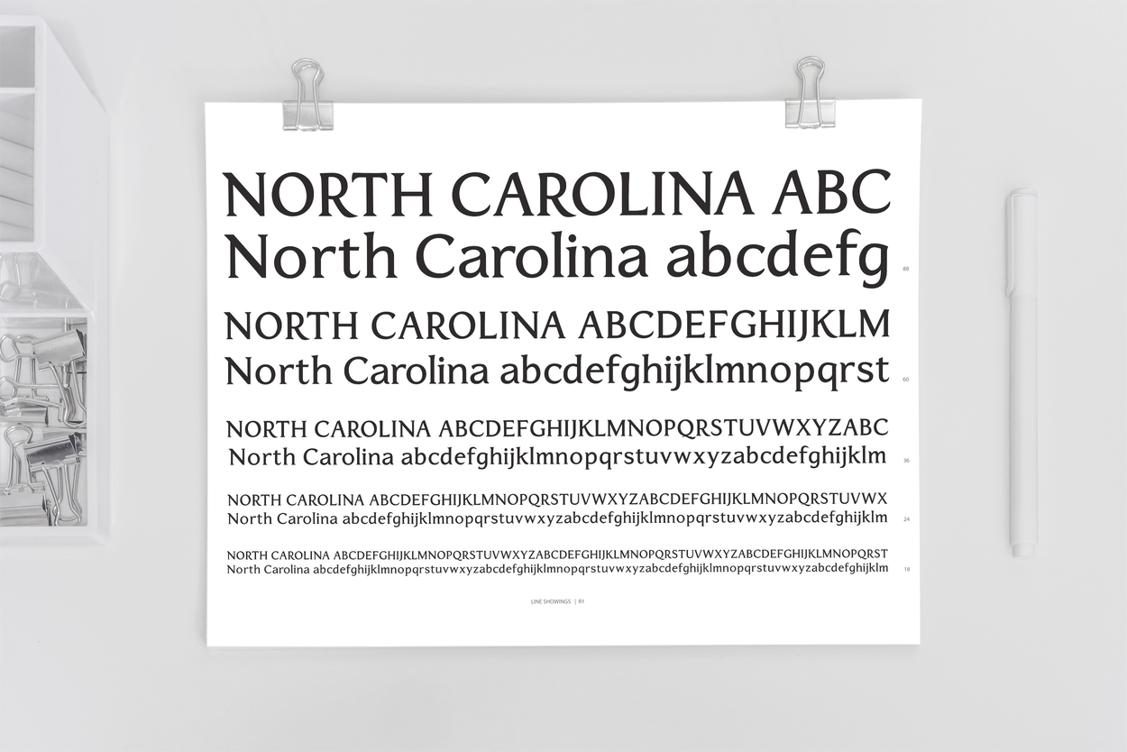
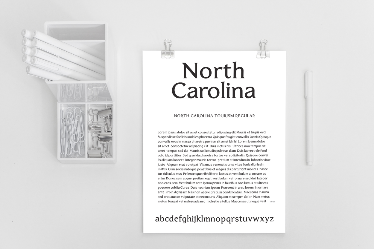
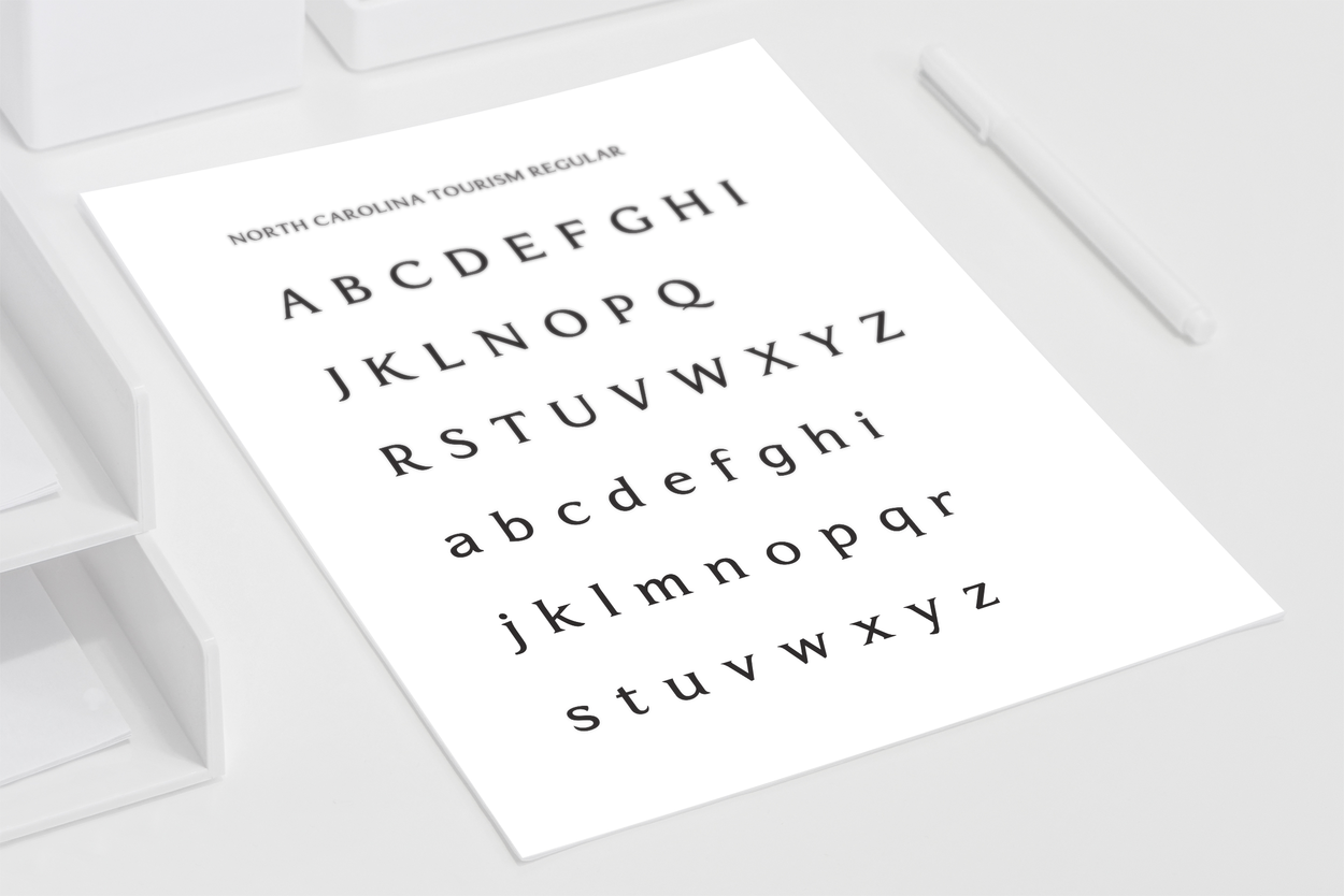
Custom typefcae for the North Carolina Tourism office via Luquire George Andrews.
Our design of this typeface was inspired and informed by the "North Carolina" Tourism wordmark provided by the Client. From this initial handful of model letters, we free-sketched and vector drafted the remaining alphabet, as well as numerals and symbols. While the original "North Carolina" lettering includes some strong and distinctive features — perfect for a standalone wordmark — we sublimated some of these attributes in the base font so that text typeset with the font would be cohesive, and free of visual and spatial snags. Once the base font was tested and tuned in successive rounds, we initiated development of the other weights and styles. The resulting family consisted of five styles: Regular, Italic, Bold, Bold Italic and Smallcaps, each one custom built to accommodate the Client’s specific typographic needs.


